-
Product Management
Software Testing
Technology Consulting
-
Multi-Vendor Marketplace
Online StoreCreate an online store with unique design and features at minimal cost using our MarketAge solutionCustom MarketplaceGet a unique, scalable, and cost-effective online marketplace with minimum time to marketTelemedicine SoftwareGet a cost-efficient, HIPAA-compliant telemedicine solution tailored to your facility's requirementsChat AppGet a customizable chat solution to connect users across multiple apps and platformsCustom Booking SystemImprove your business operations and expand to new markets with our appointment booking solutionVideo ConferencingAdjust our video conferencing solution for your business needsFor EnterpriseScale, automate, and improve business processes in your enterprise with our custom software solutionsFor StartupsTurn your startup ideas into viable, value-driven, and commercially successful software solutions -
-
- Case Studies
- Blog
The Difference Between UI and UX Design
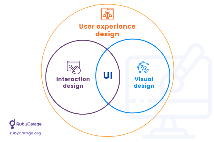
In the world of technology new terms appear every day. But though the term UX has been around for a while, people still confuse ‘UX’ and ‘UI’. At Rubygarage, we believe that UX and UI complement each other. Specifically, we believe that User Interface (UI) should be seen as a part of User Experience (UX). Let’s see why.

Defining UX
"User experience" refers to a person’s interactions with a product, application, or operating system. So designing a user experience – or in other words, creating a UX – means defining the way a product operates and how it meets a user’s needs. It’s obvious that a UX should be clear, comfortable and user-friendly. A great UX is deliberate and elaborate; you don’t even notice it when using a website.
What problems does UX?
A good UX makes website navigation simple even for first-time visitors. If a user can’t figure out how to sign up, change their password, or get to their shopping cart, then there's a clear problem with the UX. An effective UX smoothly guides a user through a website or an application. In one of our designs for German cosmetics brand ARTDECO, our team designed a one-page checkout to increase the conversion rate and simplify the checkout process.

We also adapted all storefront layouts according to principles of responsive design, meaning that the website responds to the device it’s being displayed on and shows a version of the site that looks great on that device.

However, user experience is not only about positioning blocks and creating layouts. After all, we need an interface to be an intermediator between the user and the product.
Defining UI
The User Interface includes all the controls, buttons, blocks and elements of an application – the visual elements which create a product’s feel and its unique image. Developing a UI involves selecting colors, defining corporate identity, and following the latest design principles. When working on UI, designers focus on creating the character of a product and enhancing its look. There is a reason for this: an interface is the first thing that grabs a user’s attention when they visit a website. UI also plays an important role in a user’s decision to stay on a website or leave it immediately.

When designing the interface for the ARTDECO website, we chose clean, lucid colors: black, white, magenta. This fits with the ARTDECO philosophy. Our design team also chose a minimalist style that emphasizes fashion and beauty. We followed ARTDECO guidelines to maintain their recognized brand image and highlight ARTDECO’s signature style.
Why UI doesn’t work without UX
There are many heated discussions about the terms UX and UI. Some claim that these concepts are dramatically different and cannot be compared; others see UX and UI as inseparable concepts that complement each other. At Rubygarage we believe that UI is an inseparable part of User Experience. UI and UX go hand-in-hand, which is why we always see these concepts written together as UI/UX.
In this regard, most specialists agree: no matter how great your UI is, it cannot be effective if it’s not backed up by a satisfying user experience. In other words, there is no point in making a design with high-resolution images, gradients and textures if necessary pages (for example, error page or success page) are missing.
Medium is a great example of blending quality UI and UX. Medium is a blogging platform with a clean and attractive layout. Medium’s UX attracts bloggers with its simple layout, designed to satisfy readers and writers. Their UX lets you navigate new and trending articles.

On Medium, the positioning of text, the distance between lines, and the alignment of text offer a great reading experience. In addition, Medium provides elaborate fonts which enable the author to show emphasis.
Since its launch, Medium has received much praise from famous designers including @vanschneider, @hellostanley, and @kurtvarner, as well as corporations including CreativeDash, Marvel App, Awwwards, Dropbox inc, Ramotion, Sketch App, and InVision.
Let’s sum things up
At Rubygarage we see UX as a global term that defines user’s feelings and comfort when working with an application. UI is the part of UX that enables users to interact with a product and makes a first impression. It’s important to remember that designing a good-looking app is not enough to guarantee high conversion rates and low bounce rates; UX addresses these concerns, as well as other factors that influence user loyalty.


