-
Product Management
Software Testing
Technology Consulting
-
Multi-Vendor Marketplace
Online StoreCreate an online store with unique design and features at minimal cost using our MarketAge solutionCustom MarketplaceGet a unique, scalable, and cost-effective online marketplace with minimum time to marketTelemedicine SoftwareGet a cost-efficient, HIPAA-compliant telemedicine solution tailored to your facility's requirementsChat AppGet a customizable chat solution to connect users across multiple apps and platformsCustom Booking SystemImprove your business operations and expand to new markets with our appointment booking solutionVideo ConferencingAdjust our video conferencing solution for your business needsFor EnterpriseScale, automate, and improve business processes in your enterprise with our custom software solutionsFor StartupsTurn your startup ideas into viable, value-driven, and commercially successful software solutions -
-
- Case Studies
- Blog
Devising Interfaces with UX Design Patterns
Every UX designer knows how challenging it is to create a convenient interface that will retain users. UX design is truly a work of art: you have to efficiently structure content and create logical navigation while keeping the entire interface visually pleasing.
Fortunately, there are UX design patterns that help designers devise workable solutions to common interface problems. These patterns incorporate design best practices for every single piece of functionality, whether it’s a shopping cart or a sign-in form.
UX patterns are also useful because they provide a common language for designers: mentioning the name of a familiar pattern allows you to quickly communicate your idea and eliminate misunderstanding.
Let’s dive in to discover more about design patterns.
What are UX Design Patterns?
A number pad instead of a standard keyboard for entering numerical values, infinite scroll for creating smooth flow on ecommerce websites, breadcrumbs that show a user’s path from the main page to the current page ‒ these are a few examples of UX design patterns we’re all familiar with.
Applied to user interfaces, patterns efficiently cut down on the time and effort needed to navigate. While interacting with an interface, users associate unfamiliar elements with things they’ve encountered before to built rapport with interfaces more rapidly. For example, Skype’s status indicator resembles a traffic light, so it’s easy to quickly see whether a user is offline or available.
Users expect familiar outcomes from each interaction, such as an infinite news thread that continues to be displayed as they scroll down the page. Modern design patterns ensure these expected outcomes. Every time users recognize a familiar design pattern, their brains stimulate the production of dopamine ‒ a chemical that controls pleasure centers and reward-seeking behavior.
Therefore, design patterns can stimulate dopamine production, both when a user notices a familiar pattern and when that pattern works as expected.
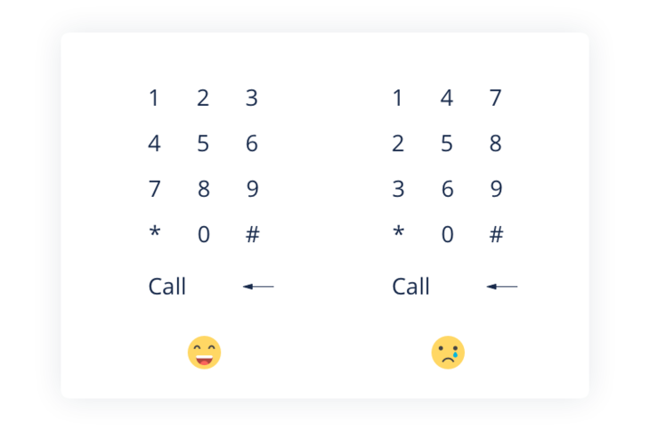
The bottom line: UX design patterns offer familiar interactions so users don’t need to analyze each interaction to navigate through a system. Design patterns reduce the time and effort spent on each interaction and maximize reward.
How to Apply UX Design Patterns
There are plenty of established UX pattern libraries that contain neatly categorized UX patterns. However, this doesn’t mean that you should use each possible pattern in your layout. Patterns, first and foremost, are solutions to usability problems, so if there isn’t a problem, you shouldn’t apply a solution.
A common strategy for choosing proper design patterns is the problem-centered approach proposed by UXPin. There are four major steps that influence the decision of a UX designer to choose a pattern or not:
- Figure out the problems that require solutions.
- Analyze other websites or mobile applications that have found a solution to these problems.
- Examine how other websites or mobile apps implement these solutions.
- Analyze each pattern and decide which is right for you.
1. Figure Out the Problems
At the very first stage, you should detect the usability issues present in the interface. You can detect these issues during research on forums and theme websites, with in-person surveys or user interviews, and using other methods aimed at detecting user “pains” ‒ in other words, figuring out what users don’t like about current design solutions and what the interface lacks. As a rule, these methods are applied when a product is in the development process.
If you’re dealing with an existing product that requires revamping, then you can employ tactics like user interviews, A/B testing, feedback from the support team, and focus groups.
Let’s say we have an ecommerce store with a high bounce rate. With the help of Google Analytics, we’ve detected an issue: users leave the website during the checkout stage. User feedback reveals that the problem lies in a long sign-up form that users have to fill in. Our problem is clear, and we can proceed to the next stage ‒ finding out how other websites deal with similar problems.
2. Analyze Similar Websites
Next, you should visit websites similar to yours and analyze their approaches to solving this issue. For our example, let’s look at FeelUnique, Victoria’s Secret, and Walmart.
As we can see, FeelUnique enables sign-in with a social login. Newcomers can use their Facebook, Google, Twitter, Instagram, or PayPal account to proceed to a short registration form that’s already filled in with name, surname, email, and country. The user only has to enter a zipcode to finish the sign-up procedure.

Victoria’s Secret enables website visitors to check out with a PayPal account or an existing Victoria’s Secret account. Or, users can check out as guests. Checking out with PayPal is convenient: a user can sign in with an existing PayPal account and rapidly share billing and payment information.
When we allow users to check out without signing in, it’s convenient for the very first purchase. However, the next time those users go to the website to make a purchase, they’ll need to enter their billing and shipping details from scratch, and their order history won’t be saved.

Finally, there’s the Walmart website that offers lazy sign-up among other sign-up options. Lazy sign-up is a win-win: customers are able to browse the website, put items in the shopping cart, and later sign up with minimum information, while the website receives a user’s email address, which can be used for marketing and promotions.

Our research shows that websites like FeelUnique, Victoria’s Secret, and Walmart use lazy checkout, social logins, and guest checkout. These are three different design patterns, and we don’t necessarily have to use all of them on our own website.
3. Analyze the Efficiency
During the next step, you analyze the efficiency of each pattern and find out which pattern matches your website’s needs. In our example, our issue is website abandonment during checkout. Therefore, our goal is to pick a pattern that will help us retain users and help them complete orders.
After comparing the patterns, we detect notable differences. For example, PayPal checkout and lazy sign-up both require a minimum of information to be filled in (such as email and password). However, not all users have a PayPal account, and a lazy sign-up requires no additional services to connect. Consider your users’ needs when choosing a pattern.
Social login is a fast and convenient way to sign in: most internet users have accounts on popular social media sites like Google+, Twitter, Facebook, and Instagram. Social logins pull in key information about users including name, surname, email address, and mailing address. This lets users fill in a minimum of information and quickly proceed to the checkout.
Let’s say we’ve picked a social login to simplify the checkout process and retain users. The final step is to look up websites that employ social logins, for example FeelUnique and Asos.
4. Dissect the Pattern
The last step is to dissect the pattern ‒ in other words, to analyze how other websites use social login and how you can customize or modify the pattern for your needs.
For example, Asos has buttons with icons and the names of social media channels ‒ Facebook, Google+, and Twitter. Asos deliberately picked the most popular social media channels that appeal to everyone. The playful tone of Asos vividly appeals to millennials, so it’s no wonder that its social media buttons don’t include professional networks like LinkedIn and Flickr.

FeelUnique has social media icons placed below the main sign-in form. Despite the fact that there’s no text, these icons are quite easy to distinguish since they have recognizable logos and background colors.

Main Categories of Design Patterns
There are a few generally accepted UX pattern types that serve the functionality present in most interfaces (for mobile and web). These categories include:
- Data input/output ‒ These patterns handle data input and feedback that a website gives in response to data received.
- Content structuring ‒ These UX design patterns streamline the overall UX flow and ensure accessibility of all page elements so users feel confident while browsing the website or app.
- Navigation ‒ These patterns ensure effortless navigation through the site and inside controls (such as menu navigation).
- Incentivization ‒ Incentivization patterns push users to perform certain actions and provide rewards for successfully completing actions.
- Hierarchy ‒ These patterns help you craft a visual hierarchy so your users can easily distinguish primary elements.
- Social Media ‒ Social media patterns encourage your users to share content and interact with others online.
Let’s take a look at a few UX patterns from each category:
1. Data Input/Output
Many websites require users to sign in, create a personal profile, pick the dates for an event, and so on. The designer’s task is to make the process of data entry fast, convenient, and error-free. This last criterion is crucial for flight or hotel booking services that need accurate data. You don’t want your users to get frustrated because of incorrectly booked flights, do you?
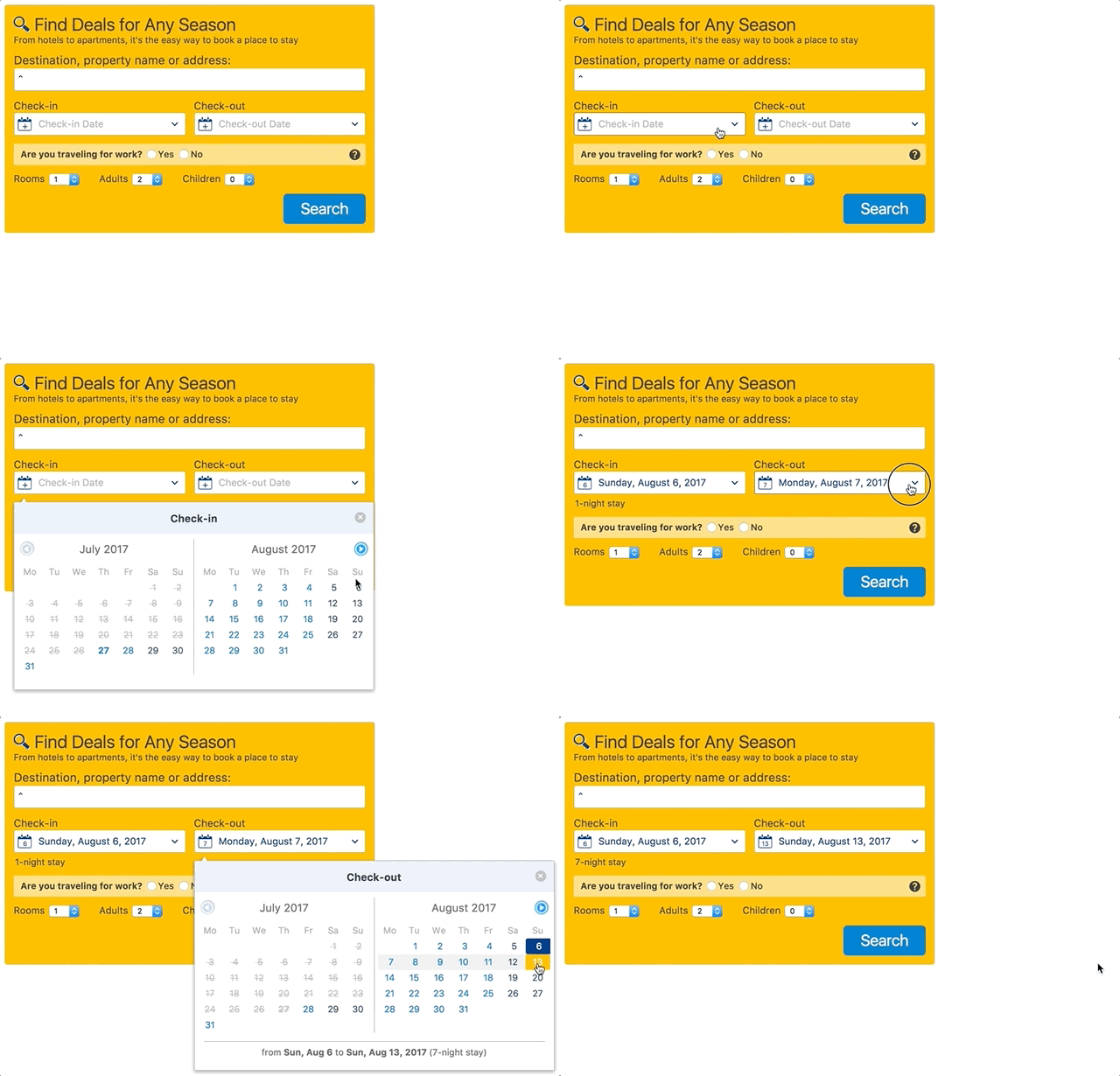
For example, if you want to provide your users with an opportunity to select dates for a flight or a room, you’re likely to use an element called a date picker (or a calendar picker). A date picker displays a calendar and lets users pick a date or a range of dates in a few clicks without entering them manually.
This pattern comes in handy when a user is required to enter dates close to the present. But if a date is too far back in the past or out in the future, it may be frustrating to click through calendars to reach the necessary date. Also, remember that in some cases users are more comfortable with manually entering dates rather than selecting them ‒ for example, when the desired input is too many clicks away.
Date pickers are convenient for selecting a date range: as a rule, such systems display two calendars side by side so a user can choose a date range in a few clicks (or taps).
On Airbnb, users can rapidly pick dates in a single drop-down calendar menu: there’s no need to select a check-in date in one box and proceed to another to pick a check-out date. Therefore, Airbnb’s visitors use fewer clicks to book an apartment. In addition, the selected date range is highlighted in a light green, so users can clearly see the selected period.

Booking.com’s date picker displays two consecutive months, unlike Airbnb’s which displays the same month in both the check-in and check-out boxes. After a user selects a date in the check-in box on Booking.com, they then proceed to another box to select the check-out date. This procedure involves more clicks than on Airbnb.
After users submit data or photo or video content, it’s important to provide them with feedback. Alert your users about both errors and success. Alerts keep your users informed and boost their confidence.
Provide input feedback with UI elements such as notifications, message boxes, colored tooltips, loading animations and images, and so on. For example, MailChimp displays a playful image of a monkey paw after a user successfully submits an email marketing campaign.

2. Content Structuring
A satisfying user experience is achieved through well-structured content, clear navigation, and quick fixes to common actions like signing up. These quick fixes reduce friction ‒ factors that prevent users from completing their goals, for example making a purchase. Jerry Cao at UXPin outlines a few factors that cause users to abandon a page:
- Visual clutter ( irrelevant images, banners, and links)
- Inconsistent interface
- Unnecessary actions
- Confusing functions
There are UX design patterns aimed at reducing friction. These patterns provide solutions for effective content structuring (like dashboards, FAQ sections, and image galleries) and simplify common procedures like social logins and autocomplete.
The dashboard pattern is a common solution for applications that involve analytics, metrics, or tracking any activity. As a rule, a dashboard displays data that informs a user about the current state of the system (like sales or website activity). A successfully designed dashboard doesn’t distract a user and communicates information well. Put simply, a dashboard enables a user to rapidly digest data from multiple sources.

3. Navigation
UX designers sometimes compare navigation to a joke, saying that navigation that requires an explanation isn’t that good. This comparison is reasonable: simple and clear navigation is one of the key factors that ensure great usability of a web or mobile app.
Web and mobile navigation patterns ensure smooth user flow, improve learnability, and reduce friction. UX designers admit, though, that patterns may lead to over-polished interfaces that don’t stand out from the dozens of similar interfaces. Therefore, the designer’s goal is to devise navigation that successfully blends familiar concepts with creative solutions.
Jerry Cao, a UX content strategist, points out that you should use common navigation patterns to create recognizable controls (like menus and tabs) that are at the same time flexible so you can easily customize them.
Let’s explore one of the common patterns for content navigation ‒ infinite or continuous scroll. Continuous scroll enables a user to keep scrolling while content is automatically loaded. UX designers use infinite scroll to encourage users to consume more content by loading content without users having to tap or click buttons ( “previous” and “next,” for instance). This pattern gained popularity due to the emergence of websites with user-generated content (social media websites like Facebook) and mobile interfaces.
Content-rich websites like Buzzfeed and Mashable use the infinite scroll pattern to engage with website visitors and make them spend slightly more time on their sites.
Infinite scroll doesn’t fit every website or mobile app, though. It may seem fun to enable users to scroll over and over again to consume loads of content, but in some cases users find infinite scroll irritating and unproductive. Here are a few cases when it’s efficient to use infinite scroll:
- When there’s too much content that it doesn’t fit on a single page and you don’t want to draw your users’ attention away from the content.
- When dealing with mobile interfaces, so users don’t have to tap small elements like “Next” buttons.
- When you don’t want to disrupt your users’ interactions with content. Users are more likely to consume content by just scrolling down than by clicking “Next” or “Read More” buttons.
- When you’re designing navigation for websites where a footer doesn’t matter much. For established businesses, a footer with “About Us” or “Contact Us” links is important, so infinite scroll may confuse users and make them leave a website.
4. Incentivization
Incentivization, or persuasive design patterns employ psychology to create cognitive triggers that push users to perform desired actions. Unlike external triggers such as CTAs, persuasive patterns build an unconscious bond between a user and a product. This bond is achieved with the help of hooks ‒ experiences that match users’ problems to solutions. As a result, users will habitually come back to your website or app and will be more likely to sign up, subscribe to a newsletter, fill in a profile, post content, and so on.
Persuasive design patterns are generally broken down into five categories:
- Cognition
- Gamification
- Perception and memory
- Feedback
- Social biases
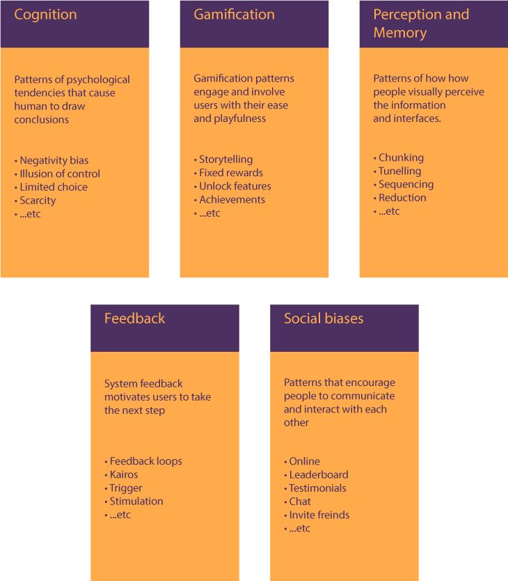
Gamified patterns include powerful tactics that push users to take another step (for example, to invite friends or prolong a subscription). Appraisals, rewards, milestones, badges, achievements, levels, points, and other tactics make it easy to encourage users to interact with a system more and more.
Codeschool ‒ an online learning platform ‒ offers a bright example of gamified persuasive patterns. Progress is a crucial metric for gamified design. On Codeschool, learners can track their course progress in their personal profiles. A progress bar is gradually fills with green indicates completion. The design pattern that’s used to showcase progress and boost user engagement is called the completion pattern.

Another pattern used by Codeschool is the achievements pattern. As a rule, this pattern focuses on personal or social achievements that matter to users. Since Codeschool is a learning platform, where the achievements are of personal significance. Users get badges for completing courses or any other piece of educational content.

Remember that gamification patterns are effective only among certain target audiences (namely children, teenagers, and millennials). Also, keep in mind that not every app should be gamified, though educational, entertainment, social media, productivity, and similar categories of apps are great for gamification techniques.
5. Hierarchy
The visual hierarchy of a website or mobile app allows users to distinguish main elements from secondary elements. While content structuring aims at positioning page blocks conveniently and neatly, hierarchy is responsible for prioritizing content.
UI and UX design tools help you achieve visual hierarchy. UI tools have a great impact on how people perceive information: it’s no wonder that big headlines draw more attention, while smaller font sizes indicate more generic information. The list of UI tricks that build visual hierarchy also includes:
- Contrast. Colors, textures, patterns, and shapes help to instantly differentiate elements that stand together.
- Colors. Bright colors are more likely to draw attention than cool shades.
- Page scanning patterns. Our eyes tend to scan a webpage in a “Z” or “F” pattern, and this knowledge can help you position content in areas where it will more likely be read.
- Space. Used wisely, negative space around an element makes that element more visible and readable.
In addition to UI design tools, UX design patterns help you build great visual aids to guide your users through a site.
One of these UX patterns is breadcrumbs. The breadcrumbs design pattern is used to indicate the user’s path from the main page to the current location. This pattern shows the hierarchy of browsed content, so users are able to switch between pages rapidly. Breadcrumbs is a popular pattern for ecommerce websites. Since most ecommerce websites have a branched structure with multiple product categories, it’s important to provide users with the ability to effortlessly come back to a product category or the main page.

6. Social Media
Social media patterns serve several functions at once. These patterns facilitate communication (chat), content sharing (auto-sharing), building social reputation (testimonials), and other social interactions (follow, invite a friend).
The social media category, despite its name, doesn’t necessarily mean using patterns in social media websites or apps. Depending on the context, these patterns are also used for building a sense of trust, competition, and user engagement.
For instance, the leaderboard pattern is commonly used to indicate the best performers in a category. It’s efficient to use this pattern in a highly competitive environment to stimulate user involvement in a game or a competition and drive a sense of community.
A successfully implemented leaderboard pattern is contextual, which means that you should compare only users with similar levels, activity rates, and so on. Also, it’s better to compare users with people from their friends lists or people who are in the same location. As a rule, people feel more involved when they compete with people they know or at least could potentially meet.
On Swarm, users compete with their friends. Despite the fact that only the top three users get bonus coins, Swarm’s interface displays other placeholders under a line. This trick allows Swarm users to see who might become their rivals next week.

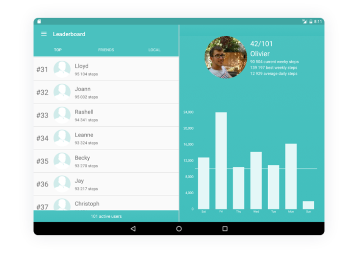
FitBit follows the best practices of the leaderboard pattern. The leaderboard on FitBit is contextual: users are able to see their ranking according to different categories including Top (overall rating), Friends, and Local. FitBit shows other users’ ranks and key metrics (like number of steps), which pushes users to compete based on those metrics.
The Takeaways
UX patterns are nice helpers in routine design tasks. If you want to find more of them, consider looking at design pattern libraries that contain neatly organized and structured patterns, including UI Patterns, Web UI Design Patterns by UXPin, and Elements of Design.
Remember, though, that design patterns shouldn’t be blindly applied to any interface. Each pattern solves an exact design issue and should be applied wisely. An excessive use of design patterns may leave your interface plain and unremarkable. Visit our Behance and Dribbble accounts to check out how we apply design patterns in our works!


