-
Product Management
Software Testing
Technology Consulting
-
Multi-Vendor Marketplace
Online StoreCreate an online store with unique design and features at minimal cost using our MarketAge solutionCustom MarketplaceGet a unique, scalable, and cost-effective online marketplace with minimum time to marketTelemedicine SoftwareGet a cost-efficient, HIPAA-compliant telemedicine solution tailored to your facility's requirementsChat AppGet a customizable chat solution to connect users across multiple apps and platformsCustom Booking SystemImprove your business operations and expand to new markets with our appointment booking solutionVideo ConferencingAdjust our video conferencing solution for your business needsFor EnterpriseScale, automate, and improve business processes in your enterprise with our custom software solutionsFor StartupsTurn your startup ideas into viable, value-driven, and commercially successful software solutions -
-
- Case Studies
- Blog
9 UX Tips on How to Create an Ecommerce Store That Really Sells
The big challenge of ecommerce websites is converting visitors into buyers and making them come back for more. If your website isn’t designed with the user experience (UX) in mind, it can hurt your ecommerce business on several levels. First, users may turn away from your site to one that’s easier and more convenient to use. Second, it can affect your search ranking as Google prioritizes the most relevant and easy-to-navigate websites.
To make the customer journey satisfying and rewarding, make sure that your ecommerce website follows the best practices of UX design given below.
1. Create a customer-centric search
Have you ever considered that your search experience has the potential to make or break online sales? Surprisingly, according to a report by Salesforce 40 percent of customers turn to intelligent assistants before making a purchase. So what exactly can ecommerce businesses implement to create a customer-centric search?
Voice search
For online retailers, voice search is an incredible opportunity to stand out from competitors and enhance the user experience. Voice recognition technology is becoming more accurate and its popularity will continue to grow according to Walker Sands’ 2017 Future of Retail Report. Voice search isn’t only about convenience; it’s about speed and ease too. Making your customers more comfortable results in better customer engagement.
The best example of a virtual assistant in the ecommerce field is Amazon Alexa. Customers can not only speak to Alexa and give her tasks but can also teach the assistant to do new things. Alexa can give information about exclusive deals, check account balances, get stock prices, and much more. Customers appreciate the convenience Alexa provides and increase spending on Amazon by 10 percent on average when using this virtual assistant.
Image recognition
In ecommerce, pictures are worth more than a thousand words. Humans are visual creatures, so we need to see items before purchasing to make sure they look good and suit our style. Sometimes you see something in the real world that looks interesting, but when you try to search for it online later, words fail you. You have this clear, colorful picture in your mind, but you can’t translate it into the words you need to find it. Nowadays there’s a solution to this issue – image recognition technology.
2. Use horizontal filtering
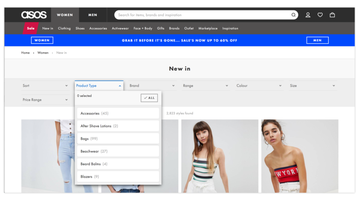
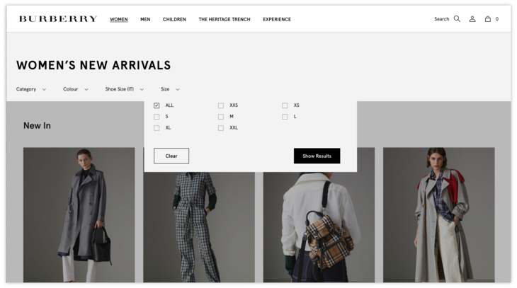
We’ve gotten used to left-hand vertical sidebar filtering interfaces on most ecommerce websites. But over the past few years the horizontal toolbar has become increasingly popular. Interested to know why? Let’s look at the advantages of horizontal filtering.
- More flexible. Horizontal filters provide much more flexibility as you may use sliders, tables, paragraphs, and so on, not just links and checkboxes.
- Shown as the user scrolls. As horizontal navigation can be pinned to the page, filters are available as the user scrolls. This delivers a more comfortable user experience.
- Full use of page width. Left-hand website navigation takes a large part of the page. Using horizontal filtering allows you to use bigger visuals and include more useful information.
- More mobile and tablet friendly. Well-designed horizontal filtering is more mobile and tablet friendly, as it allows you to use the full width of the page and to view filters while scrolling. Also, horizontal filters are more flexible when it comes to UI components.
3. Make the right choice among infinite scrolling, pagination, and Load more buttons
Choosing how products are loaded on the website is one of the most important things for merchants to consider. Let’s figure out which form of leading will best suit your online store.
Pagination
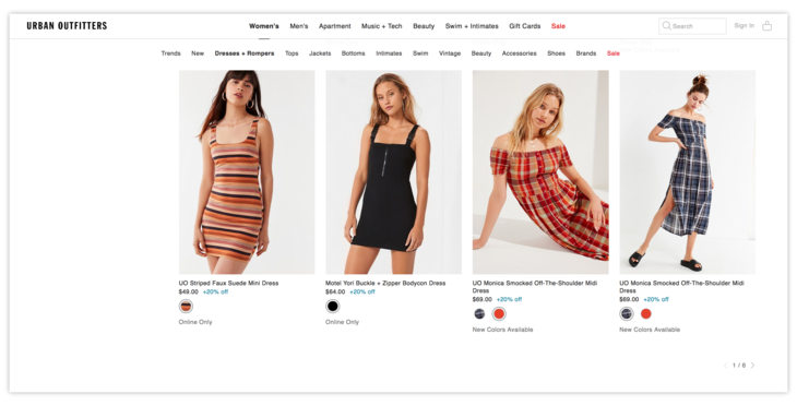
Most ecommerce websites use pagination, which is still the most popular way to load new items. If an ecommerce store has a large catalog, it makes sense not to display all products at once. By providing smaller chunks of information, you let your customers focus on the most important parts of the page. Moreover, pagination is good for people who are looking for something in particular, not just scanning. When the user sees the total number of results, they can also estimate how long their search will take.
Infinite scrolling
When infinite scrolling is implemented well, it can provide an incredibly smooth and seamless experience. This technique loads content continuously as the user scrolls down the page. The success of infinite scrolling on such sites as Twitter and Facebook has made it popular, but that doesn’t mean it’s suitable for every online business. Infinite scrolling works perfectly with a flat content structure. But it fails when it comes to goal-oriented tasks. For ecommerce websites, finding products by features might be difficult to accomplish quickly if all products are presented linearly on a never-ending page without filtering or navigation techniques to help narrow things down.
Load more
On websites with Load more buttons, like American Eagle Outfitters, users explore more products than on websites with pagination but can’t scan as quickly as with infinite scrolling. A Load more button lets the customer decide whether they want to see more products, gives them a sense of control, and doesn’t lose them in an endless flow of content.
4. Don't overload your website with product information and CTAs
People don’t like to read massive texts; it’s best to make product descriptions short and comprehensible for every customer. Here are some tips on how to make your product descriptions informative and eye-catching without overloading your website.
- Think about your target audience. Before you start writing, you should know your audience well: What makes your customers laugh? Why do they hesitate to order? What is really interesting to them? If your message is clear and creates a deep connection with your target customer, you’ll keep them interested.
- Make your descriptions scannable. Users don’t read every word on the page, so it’s best to create scannable descriptions with clear headings, subheadings, and bullet points.
- Create clear calls to action (CTAs). A СTA is an appeal to website users to take a specific action. Retailers should think of a creative and compelling way to make their calls to action as clear as possible.
5. Keep signups and checkouts simple
Nobody loves long signups and checkouts. Make these processes simple, intuitive, and most importantly short! Mobile app and website users don’t have the patience for long processes. Want to make signing up and buying easier? Here are a few things to keep in mind.
- Make onboarding as easy as possible. Don’t ask a lot of questions at the very beginning. A name and email is enough for registration; don’t require a phone number and other personal information right away. You’ll be able to ask for it later.
-
Use a single-column structure. With a single-column structure, the user’s eyes move naturally from top to bottom along a single line. With a multi-column structure, the user may not know where to start and which direction to read in. With multiple columns, registration can take longer and harm the user experience.

- Separate fields into semantic groups. Divide your checkout form into semantic groups if you have a lot of questions. This approach gives users the feeling of gradual form filling and prevents unwillingness to answer.

- Don’t use autocorrect during checkout. Autocorrect works poorly for email addresses, abbreviations, street names, and other proper nouns. If you implement autocorrect during checkout, users may have to stop and retype the right words, which takes time and wears on the nerves.
-
Validate entered data immediately after filling in each field. Validating data immediately is convenient for users as they can see if something’s wrong right after filling in a field, not at the end of the whole checkout process.

6. Newsletter signup form
Email newsletters are a powerful tool for communicating and engaging with customers. Adding a newsletter signup to your online store lets you collect customer email addresses that you can use for email marketing campaigns.
People face lots of newsletter signup forms when surfing the internet, but what catches their attention exactly? With a thoughtful approach and UX design, you can create a perfect signup form that will encourage just about anyone to sign up for your newsletter. By following the next pieces of advice, you’ll be able to increase your number of subscriptions and encourage customers to purchase from your site.
Use vivid buttons
A call to action button should be designed to attract customers to click or tap it. Don’t be afraid to make buttons big and vivid with bright, eye-catching colors. Additionally, to make newsletter signups easier and faster, provide buttons to sign up with Facebook and Twitter.
Go minimal
Minimalism is a rising trend in UX design today. Minimalism is defined as a design with the right number of elements to keep a website functional and nice looking. So when creating your newsletter signup form, try to balance the fonts, colors, and graphics yet still be stylish and functional.
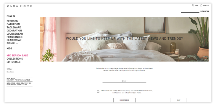
Choose the right words
People don’t like vague jargon words and complex phrases. They appreciate when they can understand your signup form or any other text on your website quickly and easily. Microcopy like “subscribe to our newsletter” or “get email updates” is a good choice.
Remember that the easier the experience you provide to the user in your newsletter signup form, the better chances you’ll have of attracting potential subscribers. Also, don’t require people to create a username from scratch, as it’s much easier to use a phone number or email address.
Use a pop-up window
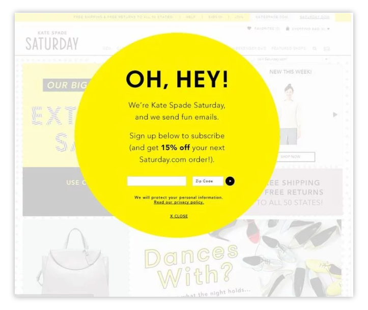
Colorful and eye-catching pop-up windows can really grab attention and focus your user’s eyes on the form.
Be careful though: in order not to make a pop-up annoying, give the user some time to look around the website first. Don’t interrupt them from the very beginning with a sign-up form. It should take about 10 to 15 seconds to get a user interested in your product or service and then users are ready to engage further. This method is considered one of the most effective to get more subscriptions when implemented properly.
As you can see in the example below, the Kate Spade newsletter signup form is vivid, readable, and eye-catching. It also gives website users some time to get acquainted with the website before it pops up.
7. Conduct usability testing
When it comes to ecommerce, minor details can have major consequences. Usability testing is extremely important both for large enterprises and SMBs when comparing two versions of a design or function to find out which performs better for users. This is when usability testing comes into the picture.
According to Econsultancy’s Ecommerce Performance Report, testing and experimentation is the best way to optimize performance and improve the user experience. When conducting UX usability testing, ask whether the user is left with any questions, whether the images are eye-catching and encourage a purchase, whether calls to action are clear, and so on. Such UX testing will help any ecommerce business to get more people into the shopping cart funnel. Below is a list of the biggest advantages your online business will get from usability testing:
- Save time and money. Investing in usability testing early on will save your business time and money. For example, making any changes to your website or app before development is cheaper and faster than after development has started. Also, clear UX design means your users will spend less time contacting support offline, resulting in fewer support staff and reduced payroll costs.
- Increased revenue. By providing a convenient user experience after usability testing, your business will make users more loyal to the brand. This leads to increased conversion rates and finally to increased revenue.
- Better reputation. Usability testing helps you to prevent some design flaws that can damage your reputation.
8. Track the right metrics
Collecting and analyzing the right data is a priority for any online business. Metrics help businesses understand the user shopping experience, determine how retailers can improve and optimize the flow, and provide insights into how your UX strategy works. But not all metrics are equal, which is really a matter for ecommerce websites.
To define which metrics are useful and which are not, we'll talk about vanity metrics and actionable metrics. Actionable metrics are concrete data that provide a clear view of what you’ve done and what the result was. Vanity metrics can look good on paper but shouldn’t be used to make a decision. This doesn't mean they’re bad or make no sense, but they can distract you from the metrics that really matter for your business growth. Let’s outline which metrics don’t impact your website and which actually matter.
Vanity metrics for ecommerce websites
- Site visits. The number of website visitors is definitely important, but only if you have a 100 percent conversion rate.
- Page views. It’s great that users visit your pages frequently, but that really doesn’t mean that all of these visits result in purchases.
- Social media likes. This is a sort of appreciation from your customers, but they often still aren’t ready to give you money.
- Time on site. Time spent on your site doesn’t matter unless it ends in a conversion.
Actionable metrics for ecommerce websites
- Usability. Usability metrics can help to track the time a user spends fulfilling a task and measure task success rate, ease of use, and other useful things.
- Engagement. Your UX team should analyze how much people interact with the website, how good they feel about it, and how much attention they give to it. Engagement metrics in combination with other useful metrics like time, scrolling, and pageviews can help designers track consistent patterns of users’ actions.
- Conversion rate. Of course, the conversion rate is the metric that everyone cares about most. The importance of this metric is not only in tracking the percentage of users who have already made a purchase but also in tracking what makes newcomers pay money for your products or services. In this case, conversion rate data can be used to design solutions to increase customer engagement and sales.
9. Establish credibility
Website credibility is made up of two dimensions: trustworthiness and expertise. When a website conveys both qualities, people will find it credible. When it lacks one of these qualities, credibility will suffer.
To make your website credible, you need to deliver products and experiences that meet real needs. Visual appeal is the most important component in meeting user needs and establishing your credibility. The first impression that a customer receives from your website design tells the story of your business.
To establish credibility, catch your user’s attention by telling the true story about the services and products you offer. Be straightforward on your About page: give a physical address, phone number, and email address for the company and make sure that your layout, typography, and images match your website’s purpose. In fact, aesthetically pleasing websites seem more credible to users according to recent research. People also assign more credibility to websites with regularly updated content. Customers reviews can make clients more confident in your website and products too.
The Amazon customer reviews section shows not only customers’ experiences with products they have purchased but also real-life photos and ratings by customers. Moreover, you can see reviewers’ profiles to make sure they aren’t fake.
Paying attention to the UX when managing an ecommerce website can help you create a delightful user experience and encourage people to stay loyal to your brand for a long time.


