


-
 Product Management
 Software Testing
 Technology Consulting
-
 Multi-Vendor Marketplace
 Online StoreCreate an online store with unique design and features at minimal cost using our MarketAge solution
 Custom MarketplaceGet a unique, scalable, and cost-effective online marketplace with minimum time to market
 Telemedicine SoftwareGet a cost-efficient, HIPAA-compliant telemedicine solution tailored to your facility's requirements
 Chat AppGet a customizable chat solution to connect users across multiple apps and platforms
 Custom Booking SystemImprove your business operations and expand to new markets with our appointment booking solution
 Video ConferencingAdjust our video conferencing solution for your business needs
 For EnterpriseScale, automate, and improve business processes in your enterprise with our custom software solutions
 For StartupsTurn your startup ideas into viable, value-driven, and commercially successful software solutions
 -
-
- Case Studies
- Blog
Checklist: Make Sure Your Website Is Mobile Friendly


Mobile is growing “faster than expected.
The importance of building websites that work on mobile has been advocated for years. We have no doubt you’re well-aware of the benefits that mobile friendly websites provide. But even though all serious websites have gone responsive, designers still make mistakes when revamping their websites for mobile devices.
In this article we’ll walk you through a checklist for getting your website ready for mobile.
Responsive Design is a Must
As people increasingly search on their mobile devices, we want to make sure they can find content that's not only relevant and timely, but also easy to read and interact with on smaller mobile screens.
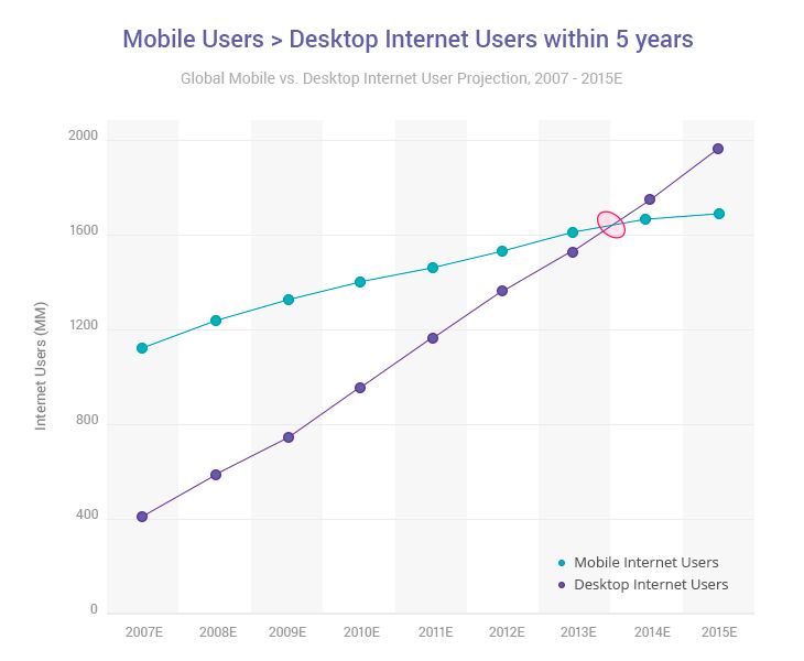
Sometime in 2014 the number of mobile internet users reached parity with the number of desktop internet users. Since then the number of desktop internet users has been flatlining while the number of mobile users continues to climb.
In response, websites have been evolving to offer better mobile experiences. In practical terms, this means that websites have been adopting responsive designs.
Since April 2015, Google has been ranking mobile-friendly websites higher in search results than those that are still living in the desktop era.
We all know how frustrating it is to pinch and swipe around a website trying to find a checkout button or product cart. These sites are frustrating, so it’s an excell/ent choice on Google’s part to de-prioritize them in search.
In short, if a website isn’t mobile-friendly, its traffic will drop, its user engagement will be dismal, and its retention metrics will make developers depressed. If you want modern smartphone-browsing customers to even consider your services, then your mobile internet experience must be smooth and enjoyable.
Here’s four practical steps how to make your website mobile friendly.
Mobile-friendly Checklist
Refine your visuals
Creativity is great, but don’t try to be super creative and use all the design principles at once. When a user sees too many objects of differing colors and styles on a tiny mobile screen, it can make their head spin. In other words, they simply leave your site. Quality design is never loud. It’s sensible, and it guides the user through your site. Minimalism is the key to a great mobile site.
Get rid of redundant content
Though the screen sizes of mobile devices have grown larger, they’re still smaller than laptop or desktop screens. It’s important not to crowd a small screen. The fewer the text and visual elements on a mobile site, the easier it is to navigate.
This is especially important for people on the go — while shopping or glancing at a screen between meetings.
This image illustrates redundancies and demonstrates how to present content more clearly:
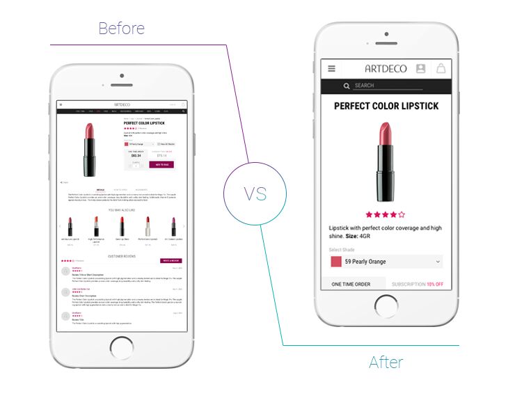
On the left screen we see an overcrowded page with icons that are tiny and seem to repeat. On the right screen we see a page with big icons that are unique and represent categories of items.
The right screen is better because there are no duplicate elements to mislead you. It’s easier to find what you need, and there’s no need to zoom in and squint at product descriptions.
Make it thumb-friendly
What’s the most important action that a user can take on your site? Is it making a purchase? Or liking a post? Or reading a specific text? Make sure that this action can be accomplished with only a thumb.
To accommodate more information on a small screen, some designers mash links and buttons right up against each other. Unfortunately, this often leads to unintended button presses (and frustrates your users!).
Prioritize and make your most important call to action buttons large enough so that users can click on them without zooming and having to use their pinky.
Speed up your pages
Mobile users care a lot about a website’s load speed. They get irritated if your pages takes more than a few seconds to open.
When designing for mobile, keep in mind that some users may have slow internet connections. While LTE is spreading rapidly throughout the US, there are still plenty of places around the globe (and some in the States) that are stuck on old Edge networks. To troubleshoot poorly performing websites, use special free page load speed tools such as Google’s PageSpeed Insights or GTMetrix. These tools analyze how well your site loads and provide actionable recommendations for how to optimize it.
Quite often a page’s speed is held back by data-intensive image or video content. Optimizing your images will vastly improve your page load time.
But it’s not only front-end performance that affects web page load time.
If you care about both user experience and your search engine rankings, you should improve both the front-end and back-end performance of your website.
You’ve done it!
Congratulations! Your website is now ready for mobile success! Of course if you would like a professional opinion about your site, you can always come to Ruby Garage for a design review.
Our Infographic: Make Sure Your Website Is Mobile Friendly

If you would like a consultation about the usability and page-load time of your mobile website, feel free to contact us at RubyGarage.
Authors:

Viktoria K.
Copywriter

Anton S.
UI/UX Designer