-
Product Management
Software Testing
Technology Consulting
-
Multi-Vendor Marketplace
Online StoreCreate an online store with unique design and features at minimal cost using our MarketAge solutionCustom MarketplaceGet a unique, scalable, and cost-effective online marketplace with minimum time to marketTelemedicine SoftwareGet a cost-efficient, HIPAA-compliant telemedicine solution tailored to your facility's requirementsChat AppGet a customizable chat solution to connect users across multiple apps and platformsCustom Booking SystemImprove your business operations and expand to new markets with our appointment booking solutionVideo ConferencingAdjust our video conferencing solution for your business needsFor EnterpriseScale, automate, and improve business processes in your enterprise with our custom software solutionsFor StartupsTurn your startup ideas into viable, value-driven, and commercially successful software solutions -
-
- Case Studies
- Blog
Review of Comet or Adobe XD - New Experience Design Tool
Last Monday Adobe announced that their Project Comet is now known as Experience Design and can be accessed for downloading and using by anyone with an Adobe ID account. That’s great news for UI/UX designers, and here’s why.
Background
A few years ago interface designers had only Adobe Photoshop for their work, which actually was not intended for such kind of tasks. Creating a web or mobile project with tens or even hundreds of screen states was just a nightmare. It took forever to change a color of a button in all, say, 150 files. This pain was obvious, yet there were no better instrument…
…Unless Sketch for OS X popped up in 2010. This product quickly gained popularity among designers thanks to its neat and simple interface and fast work. What’s most important is that everything was designed in Sketch to fit designers’ workflow. As a result, the app even won an Apple Design Award in 2012.
Sketch hit Adobe’s positions on the market and forced them to quickly improve Photoshop. Many things were done and introduced within the next few years — like artboards and the asset generator tool — but they weren’t changing the situation significantly. It became obvious that Photoshop cannot compete with quick and easy-to-use Sketch.
However, Sketch also wasn’t an all-in-one solution for interface designers. When we create products from scratch, we start with making user experience sketches (wireframes), which then are all collected in a single prototype to be demoed and tested. Such approach requires a tool like InvisionApp, which allows quick prototyping but has almost no ways to actually design the interface. In the end, we do the double work by designing screens in Sketch and then importing them into InvisionApp just to link them and create a prototype.
Adobe launches Comet
Having all above-mentioned figured out, in the end of 2015 Adobe announced that it starts working on a new product aimed to both design and prototype interfaces. It’s name was Project Comet
When the first demo video was introduced, people started chit-chatting that Adobe’s making a ‘Sketch killer’. Indeed, the presented product resembled Sketch in its general approach, but also had the Prototype mode allowing to create interactive prototypes similar to the ones in InvisionApp. Having that available in a single product seemed to be not only extremely handy, but logical as well.
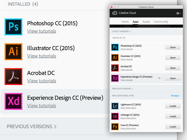
Back then Adobe said the product would be released somewhere in the beginning of 2016, with no exact dates specified. Knowing that designers are really waiting for Comet, Adobe eventually released a first preview version on March, 14. Since then everybody having an Adobe Creative Suite subscription can see a new app renamed from Adobe Project Comet into Adobe Experience Design in their app manager

Interestingly, I didn’t notice significant buzz around this news, because it turned out the product doesn’t look like it was expected. Maybe that’s why Adobe released it under the version 0.5 and called it Preview, probably pointing us out that it’s too early to complain. Besides, at this moment Experience Design is available for OS X only, though the Windows version is also promised to be released.
Hands-on Review
So let’s take a deeper look at the first public beta (let’s call it this way) of this tool for interface design and figure out if it really aims to revolutionize the way design can be done, or it’s just another marketing move.
Pros:
The interface. It’s really clean and intuitive, which is a plus. It looks very much like Sketch, and that makes it significantly easier for Sketch users to migrate to XD.

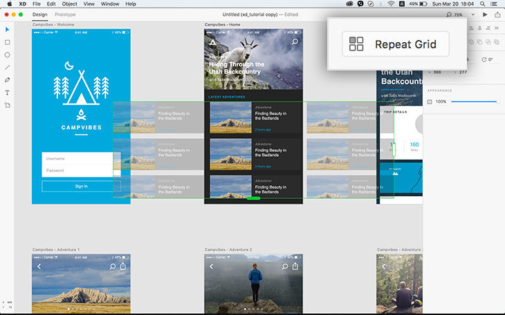
Target audience. You can immediately notice that the product is indeed intended for interface designers. For instance, the Repeat Grid tool is amazing, allowing to create content grids (such as post lists, inventory catalogues and user tables) extremely quickly.

Integration. XD is fully integrated with other Adobe’s products, so you can quickly copy assets from Photoshop or Illustrator and then paste them into Experience Design.
Content recognition. It feels like XD recognizes the type of content you’re trying to drag-and-drop in it. For instance, if you drag-and-drop an image from Finder onto the required object in Experience Design, the app will automatically make an image mask for this object.

Prototype mode. This one is indeed flabbergasting. You will immediately notice that connecting screens is done much easier in XD than in InvisionApp, where you’re forced to choose them from long lists. You can also set parameters for each transition between screens to define its type, duration and dynamics.

Prototype preview. XD allows sharing prototypes by uploading them to Adobe servers so that you could then get a link and send it to, say, a client for demonstration. Just a nice feature that may come in handy.

Cons:
Lack of the layer panel. That’s the first thing I noticed. If your screens are overloaded with elements, you may find it hard to reorganize existing objects.
Too plain and limited tools for creating new graphics. But maybe that’s OK considering the fact that you can import existing assets from Photoshop and Illustrator.
Absence of styles and symbols. These are really effective and irreplaceable in Sketch.
Almost no layer effects. You will barely find any layer effects except Drop Shadow, which, again, is a minus if compared to Sketch.
Conclusion
To sum it up, I’d call Adobe’s Experience Design a hybrid of limited Sketch and improved InvisionApp, which makes it worthy to look at for interface designers.
Yes, it has several significant disadvantages, but, in the end, it’s only version 0.5 Preview. I’m sure that at the moment we should treat it as a demo of a great tool with lots of new features and nice surprises in version 1.0. Nevertheless, you can already use it for a real work, when you need to create a simple prototype and share it with others as quickly as possible.


