-
Product Management
Software Testing
Technology Consulting
-
Multi-Vendor Marketplace
Online StoreCreate an online store with unique design and features at minimal cost using our MarketAge solutionCustom MarketplaceGet a unique, scalable, and cost-effective online marketplace with minimum time to marketTelemedicine SoftwareGet a cost-efficient, HIPAA-compliant telemedicine solution tailored to your facility's requirementsChat AppGet a customizable chat solution to connect users across multiple apps and platformsCustom Booking SystemImprove your business operations and expand to new markets with our appointment booking solutionVideo ConferencingAdjust our video conferencing solution for your business needsFor EnterpriseScale, automate, and improve business processes in your enterprise with our custom software solutionsFor StartupsTurn your startup ideas into viable, value-driven, and commercially successful software solutions -
-
- Case Studies
- Blog
6 of the Best B2B Website Design Practices to Learn
The huge demand for business services has resulted in B2B websites becoming more important than ever. Due to this fierce competition, it’s crucial to design a B2B website that helps firms stand out. But how can you create such a prosperous website?
In this article, we’ll guide you through the most significant elements of B2B website design. By following these best practices, you can achieve excellent results – reaching the right people, building credibility, and boosting your sales. Keep reading!

Before we examine B2B website design best practices, it’s important to highlight the differences between B2C and B2B design.
What differentiates B2B from B2C?
These two segments have a lot in common, but there are some critical differences you should consider.
Target audience. Bear in mind that each audience has different pain points, behaviors, and motives. In the case of the B2C segment, the target audience is individual consumers, who tend to make buying decisions based on emotional factors. However, B2B marketing is aimed at businesses. B2B buyers make their purchasing decisions as rationally as possible.
Goals. An immediate sale is the typical goal in the B2C segment, while a B2B website is eager to build a relationship with buyers. That’s why it’s better to give careful thought to contact information and branding on your B2B website.
Buyer’s journey. The B2C buyer’s journey is much shorter, since it ends in the shopping cart. The B2B buyer’s journey isn’t so fast. Buyers usually need to fill out a contact form or contact a sales representative. Therefore, a B2B website should contain powerful CTAs and a visible contact us page.
In view of these differences, let’s talk about B2B website design tips.
Six design tips for your B2B website’s success
Here are six B2B website design best practices you need to follow.
#1 Create an intuitive site structure
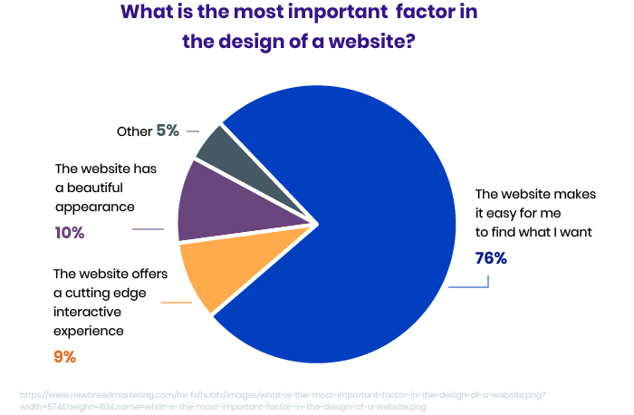
In a survey by HubSpot, 76 percent of people answered that the most important factor in a website’s design is ease of use.
There are two keys to any lucrative B2B website: clearly organize information and provide сonvenient navigation. Make your navigation menus uncluttered, without too many categories. Apply dropdown menus guiding visitors to particular sections. Clearly organize your website and allow your visitors to easily examine what’s on it.
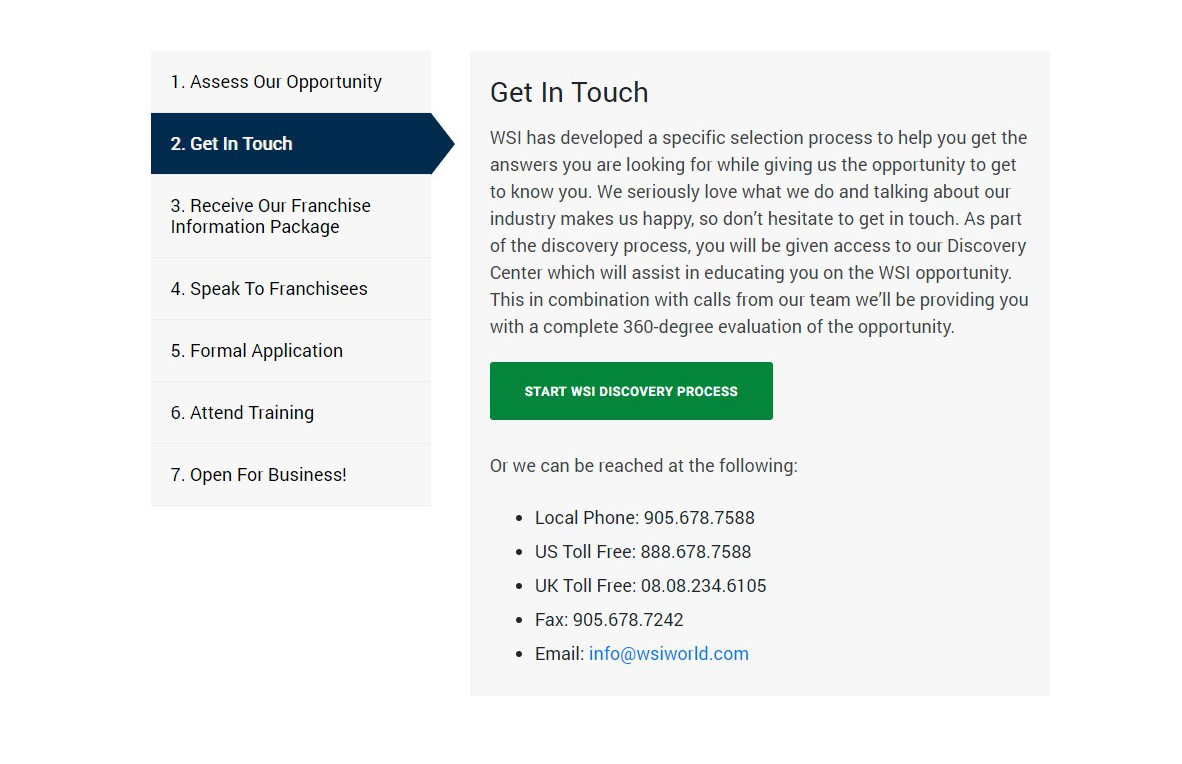
Here’s how WSI uses tabs to walk the user through related content.
#2 Define your value proposition clearly
There are always competitors on the market and a clear value proposition could be helpful. A value proposition is a great chance to state what you offer, what makes your product or service different from others, and how buyers will benefit from that. All of these facts should be reflected in a concise and clear statement. Keep your value proposition short and to the point.
Let’s take a look at an example of a great value proposition for the marketing automation and an email marketing service MailChimp.

MailChimp positions itself as a smarter marketing solution thanks to its marketing automation platform. This value proposition shows customers how MailChimp could be beneficial.
#3 Use visible and consistent CTAs
No matter how attractive your website is, if it doesn't contain a visible CTA, it’s all for nothing. If your visitors have no clear idea of what they need to do to proceed, they’ll simply leave your website. Don’t waste your time and effort. To avoid this, use clear, attractive calls to action that explain to your website visitors what to do next and lead them to complete your offer. Let’s see how Nutshell did that.

#4 Provide contact information prominently
As KoMarketing states, the primary reason why visitors leave a website is lack of visible contact info. Moreover, Huff Industrial Marketing, KoMarketing, and BuyerZone have found that 64 percent of people want to see contact info when visiting a website.
A contact information page should be well thought out to create a positive relationship with potential customers. Here are the key things to consider when creating a contact us page:
- Make the page easy to find in website navigation
- Provide a short and clear contact form
- Include all possible ways to contact you: email, social media accounts, messengers
Below, you can see a great example of a contact us page. In addition to being visually appealing, this Magnetica page provides all required information in an easy to navigate way.

#5 Demonstrate what stage of the sales funnel a user is at
So as not to make a B2B website confusing, always show your visitors what stage of the sales funnel they’re at. Your website should keep your potential customers informed about what’s going on. Allow them to know exactly where they are. So don’t ignore the following elements:
Progress bars to show website visitors the loading progress so they know what’s going on.
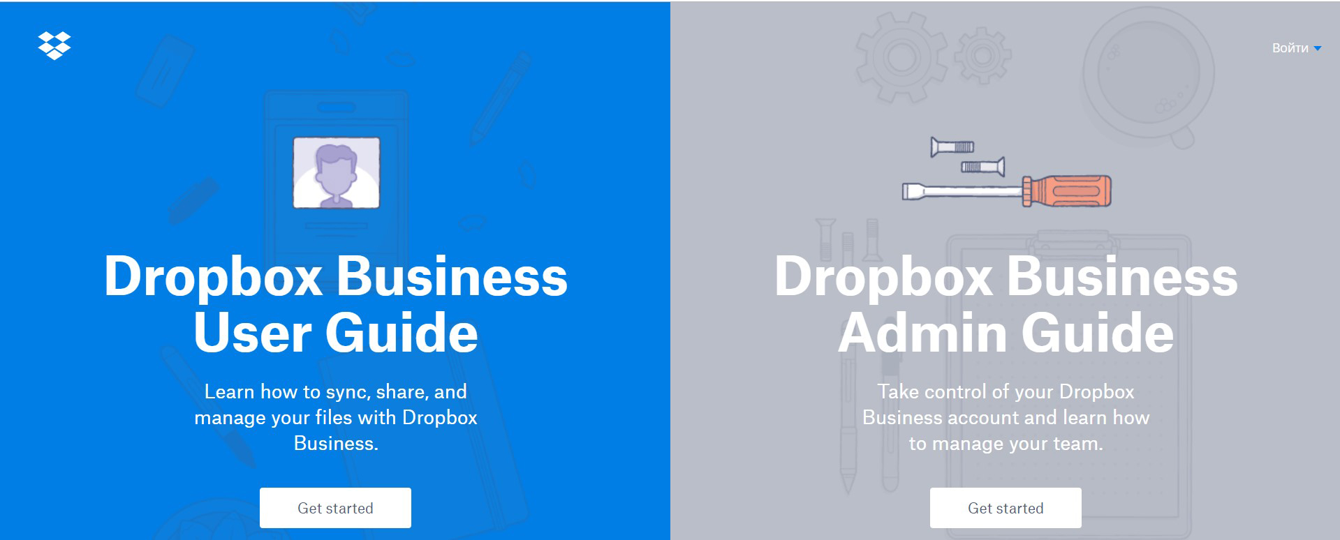
Breadcrumb navigation to show your visitors where they are on your website at all times and to give your potential customers a clear picture of how they got to your website.
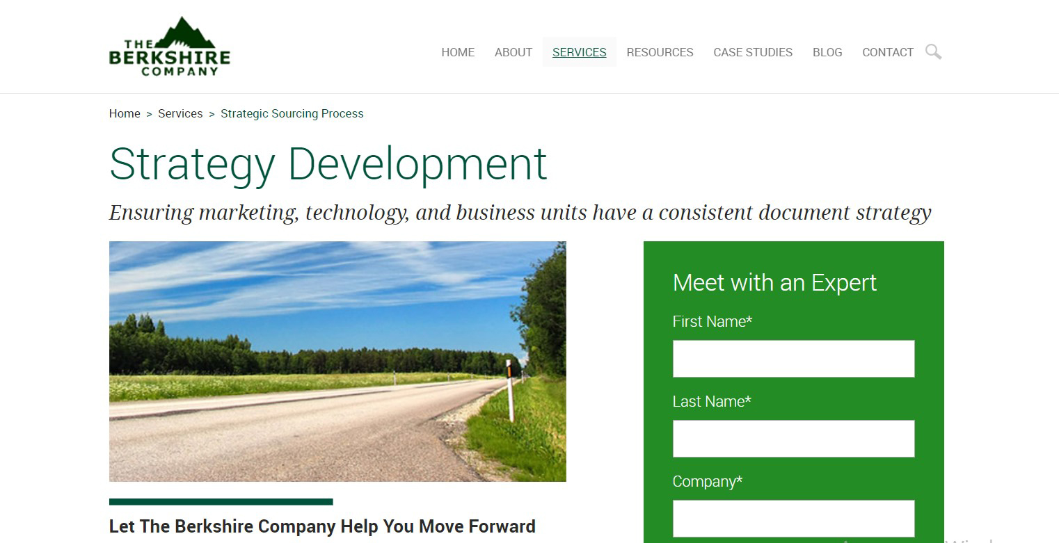
Highlight the active menu item so your website visitors know where they are. When a user clicks on one of the menu options, this item can be underlined, bolded, etc.

Thank you pages confirm your website visitors’ actions, such as filling out a form or requesting a demo. In addition, a Thank You page is a great tool to really show your personal appreciation.

#6 Show proof of demand
Today, 85 percent of consumers trust online reviews as much as personal recommendations. So if you state that you can help businesses reach certain goals, provide proof. Showing your happy customers and their success stories will allow you to build a trusting relationship with people, increase website traffic and sales, and create a positive brand image.
These are some of the most effective ways to show proof of demand on a B2B website.
Ratings can actually improve the overall credibility of your company. For example, Mailchimp links to ratings by G2 Crowd and shows its website visitors that it was ranked fourth in the Best Software Companies 2019 rating by G2 Crowd.

Testimonials boost persuasiveness. In addition, testimonials allow your other potential customers to even better understand how your product or service can benefit them.

Case studies not only demonstrate your expertise but also perfectly show how a particular issue was dealt with using your product or service. They’re a great tool to show businesses how you can solve their issues.

What’s best for your B2B website?
To make your visitors’ first impressions of your brand positive, use these best practices when designing your B2B website. Ensure that your B2B website design provides a seamless, pain-free, and satisfying experience to your visitors. Always bear in mind your target audience, what they expect from your website, and what you need them to do. All this can help you build a trusting relationship with your website visitors, boost conversions, and, finally, speed up your business growth.


